Layout system
We do not provoke recognisability through a design that is always the same, but through the consistent use of elements. We impose as few rules as possible in order to enable simple and quick expandability, thus giving more room for creativity.
DEALING WITH EXTREME FORMATS
A layout becomes an extreme format if the shorter side of the format is less than 1/3 of the length of the longer side of the format.
Definition of an extreme format;
Shorter side < 1/3 in relation to the longer side
No extreme format;
Shorter side > 1/3 in relation to the longer side
The logo size adapts to the format, but is never larger than 1/2 of the shorter side of the format.
LAYOUT GRID
Layouts can consist of a full-surface image or two subdivisions. The subdivision of the format is either on the horizontal or vertical axis, is always rectangular and is in the bleed.
The areas can either be filled with a primary colour (TECE blue or white) or with an image.
Image to image or text to text divisions are not permitted. The ‘Stage’ and ‘Signature tag’ must have a safety margin of at least 1/3 of the side length of the ‘Stage’ and must not overlap across both parts.
ADS AND POSTINGS
Format
The format of an advert can be created flexibly (as required)
Logo und grid
‘Stage’ and “Signature tag” are adapted to the corresponding format. Likewise, the grid and the protection margins are based on the rules defined under layout system.
Image and text
Depending on the motif, the text can be placed directly on the image (legibility must be ensured). Alternatively, a blue or white area (98% white) can be added (see layout system). The font colour can be white or black, depending on the background.
Download
Banner Ads Templates (Login required)
Download
Posting Templates (Login required)
Download
Social Media Ads Templates (Login required)
Download
E-Mail Signature Banner Templates (Login required)
Video
The video design picks up on the basic design language of the TECE corporate design. The design is expanded to include independent video-specific elements.
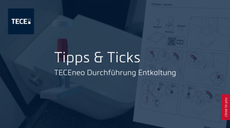
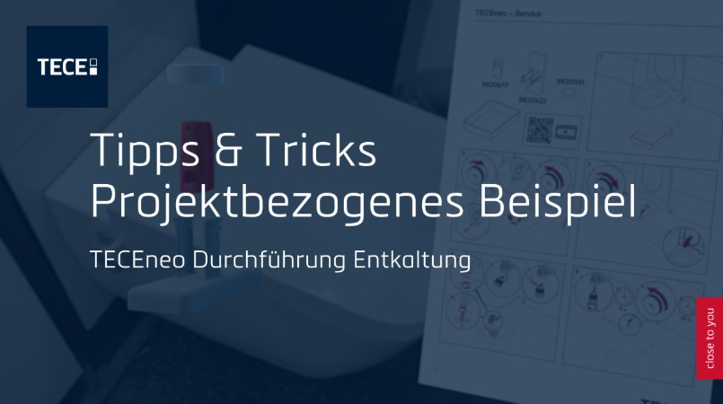
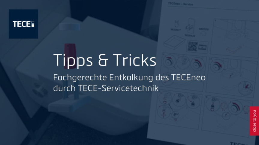
Example
The following specifications for video creation were taken into account in this example video.
Download
Here you can download the templates you need to create videos that comply with the TECE corporate design.
Video-Templates(Login required)
Intro
- No fade-in, direct entry into the intro
- Font/text background: 75 % TECE blue (RGB: 0,29,59)
- Font family: Metronic Pro Light white
- Background should move slightly (any movement possible), no cuts during logo or text insertion
- Always place text centred in the image
- Text without a full stop at the end
- Text length: long enough in the image so that the title is easy to read; duration depends on the length of the text
Logo and text overlays
- Show stage and signature in the intro
- Headline: Metronic Pro Light white 240 px, character spacing: 25,
Line spacing: 215 px - Subheadline: Metronic Pro Light white 125 px, character spacing: 25,
Line spacing: 215 px - Simultaneous fade-out of logos, text and blue font
Hard cut or soft fade-out, length 10 frames ease-in/ease-out

Text overlays II
- Static insertion of a two-line headline and one-line subheadline
- Headline: Metronic Pro Light white 240 px, character spacing: 25,
Line spacing: 270 px - Subheadline: Metronic Pro Light white 125 px, character spacing: 25,
Line spacing: 270 px - Simultaneous fade-out of logos, text and blue font
Hard cut or soft fade-out, length 10 frames ease-in/ease-out
Text overlays III
- Static insertion of a one-line headline and two-line subheadline
- Headline: Metronic Pro Light white 240 px, character spacing: 25,
Line spacing: 215 px - Subheadline: Metronic Pro Light white 125 px, character spacing: 25,
Line spacing: 160 px - Simultaneous fade-out of logos, text and blue font.
Hard cut or soft fade-out, length 10 frames ease-in/ease-out
Lower third look & positioning
- Font/text background: 75 % TECE grey (#cccccc)
- Font family: Metronic Pro Light black
- Single-line text: 45 px, character spacing 10
- Animation: Simultaneous fade-in and fade-out of font background and text:
10 frames, ease-in/ease-out
Alternative: hard cut, depending on what fits better
Lower third look & positioning II
- Font/text background: 75 % TECE grey (#cccccc)
- Font family: Metronic Pro Light black
- Double-spaced: Text above 33 px, character spacing 10, line spacing 55 px
Text below 45 px, character spacing 10, line spacing 55 px - General lower third length: long enough in the image so that the text is easy to read; duration depends on the length of the text

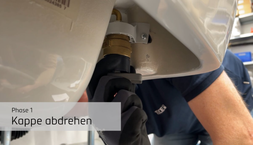
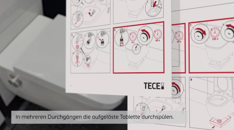
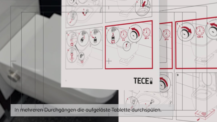
Text field: phases
- Font/text background: 75 % TECE grey (#cccccc)
- Font/text background: 75 % TECE grey (#CCCCCC)
- Description (e.g. „Phase 1“/EN: „phase 1“): 90 px, character spacing 25
- Project (e.g. „Kappe abdrehen“/EN: „unscrew cap“): 160 px, character
spacing 25 - Animation: Font background and text animation available as a template